Large-scale engineering projects rely on multiple tools, teams, and workflows. Data is scattered across systems, making it difficult to access, reuse, and trust.
The Problem
Engineers spend more time searching, validating, and recreating data than actually designing.
Key issues
Fragmented data across tools (BIM, Excel, documents)
No consistent structure across projects
Repetitive manual workflows
Limited reuse of past project data
Difficulty finding past project data
Recreating work from scratch
No single reliable source of truth
Responsibilities
Translated system architecture into usable UI Designed workflows for project navigation and data access
Simplified complex data structures into intuitive interfaces
Worked closely with engineers to align UI with real workflows
Research, interviews, and data strategy were conducted by the broader team
My Role
As a Product Designer, I focused on designing the interface and experience layer for a complex data system.
Understanding The System
Before designing, I aligned with research and stakeholder insights to understand how data flows across the system.
Before (Existing workflow)
Data created in multiple tools
Manually transferred between teams
Reinterpreted at every stage
After (ProjectFlow approach)
Central system connects all data
Structured workflows across tools
Continuous data loop instead of linear flow
Key Insight
The problem wasn’t the tools, it was the lack of a connected data structure across them.

Principles
Reduce cognitive load
Make data easy to navigate
Bring multiple tools into one experience
Support both overview and deep-dive usage
Design Approach
My goal was to make a complex data system usable, navigable, and actionable.
Solution
Unified Project Dashboard
Designed a centralized dashboard to give users a clear overview of all projects, status, and key data.
Start with a Unified Overview
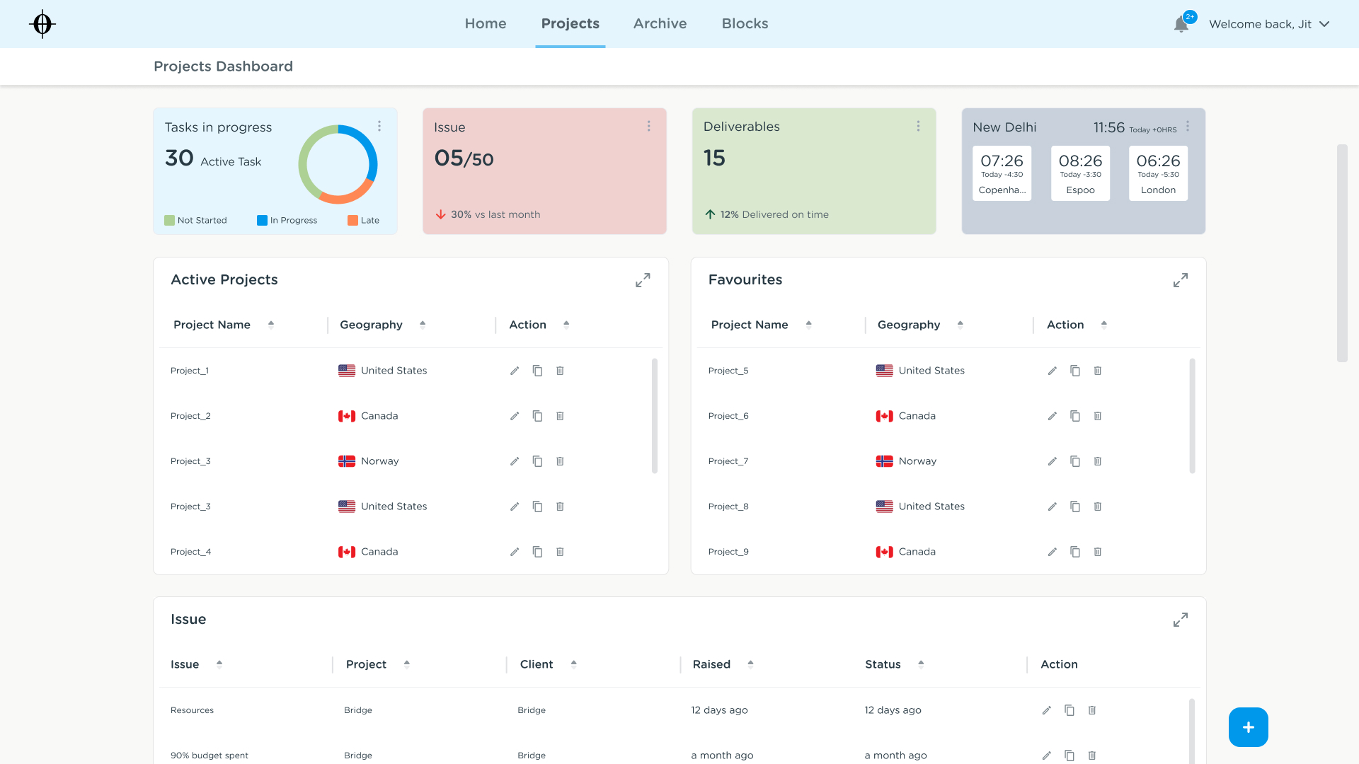
Users get a centralized view of all projects, including task status, issues, and deliverables.
This reduces the need to navigate across multiple tools to understand project health.
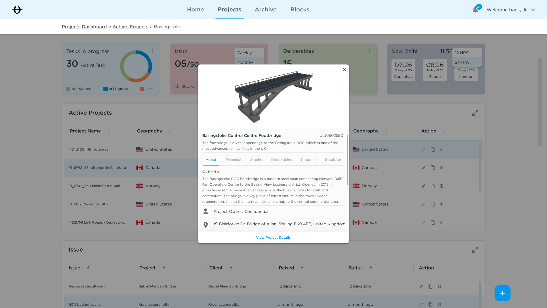
Access Project Details Instantly
Users can quickly preview key project information without leaving the dashboard, enabling faster decision-making and reducing navigation effort.
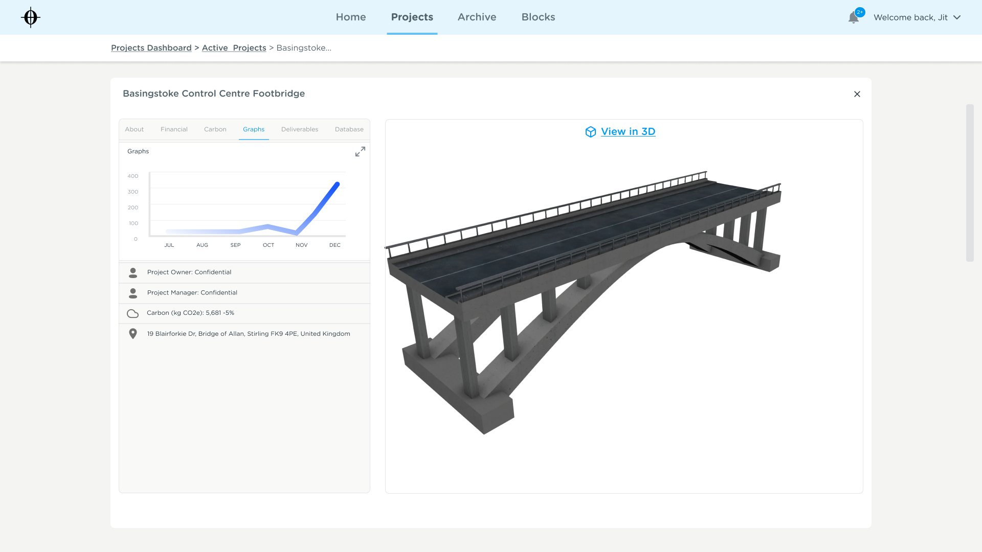
Understand Projects in Context
A structured layout organizes project data into clear sections (overview, financials, graphs, deliverables), allowing users to access both high-level and detailed information in one place.
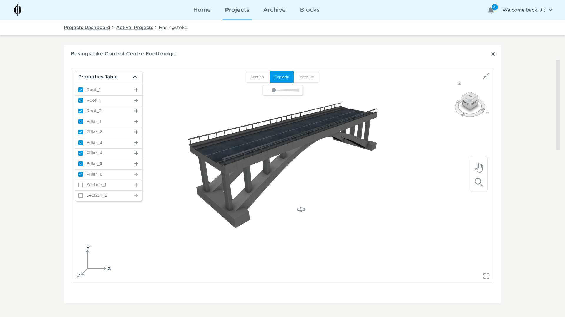
Explore Data at Multiple Levels
Users can interact with detailed project components through a 3D interface and property panel, making complex data more accessible and easier to interpret.
This experience connects fragmented data into a continuous and navigable workflow, reducing cognitive load and improving efficiency.
Impact
The solution improved how users interact with project data.
Reducing time spent searching for information
Improving visibility across projects
Enabling structured reuse of data
Supporting more consistent workflows
Key learnings
Translating abstract systems into usable interfaces
Designing for multiple roles and workflows
Balancing simplicity with system complexity
Reflection
This project strengthened my ability to design for complex systems and enterprise workflows.