Designing a unified data management platform that transforms how engineering teams access, share, and build on project knowledge — from scattered silos to a single source of truth.
Role
UX / UI Designer
Sector
Engineering & Infrastructure
Timeline
20 Weeks
Platform
Web Application (Desktop-First)
My Contributions
10+
Core screens designed across 4 primary modules
Responsibilities
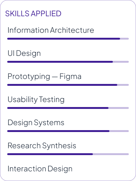
Information Architecture · User Flows · Wireframes · UI Design · Design System · Prototyping · Usability Testing · Design Iterations
Engineering firms delivering large infrastructure projects hold decades of valuable knowledge, but most of it remains scattered across folders, emails, and individual teams.
As a result, projects often start from scratch. Engineers waste time searching for references, and managers lack a clear portfolio view.
Project Flow was built to solve this — helping teams access past and active projects faster, track project status in real time, and create a more connected way of working.
The Existing Problem
No single place to find or compare past projects
Knowledge lost when team members leave
Every project starts completely from scratch
No audit trail for deliverables or decisions
Workflow Issues
Multiple disconnected tools not integrated
Manual effort to compile deliverables
Version control informal or non-existent
Historical data required days of chasing people
Business Impact
Engineers spend time searching, not designing
Inconsistent quality across client deliverables
Can’t benchmark new work against past work
Lost institutional knowledge compounds over time
02 — My Role & Responsibilities
Where I stepped in
I joined after the foundational research phase. My role: translate existing insights into interfaces.
What I Owned
UX workflow creation and user journey mapping
Information architecture and site mapping
User flow design (task flows, decision points)
Low, mid, and high fidelity wireframes
UI design and visual design direction
Design system and component library
Interaction design and micro-interactions
Prototype creation in Figma
Facilitation of usability testing
Design iterations based on feedback
Completed Before My Involvement
These activities were owned and executed by the client’s domain team and stakeholders prior to my engagement:
User interviews with engineers and project managers
Domain research and expert knowledge synthesis
Single Point of Truth (SPOT) framework development
Building Block approach conceptualisation
Initial data architecture strategy
Platform technical requirements gathering
“My role focused on translating existing research insights into user-centred experiences — not generating the research.”
03 – Problem Statement
“Engineering teams cannot efficiently access, compare, or build upon historical and active project data — resulting in repeated effort, inconsistent output quality, and an institutional knowledge gap that grows wider every year.”
Synthesised from domain research — Project Flow
Current Challenge
No unified place to find, compare, or store project data across the organisation.
User Pain Point
Users spend time hunting for information rather than designing and engineering.
Business Impact
Inefficiency compounds at scale — every hour searching is an hour not delivering.
04 — Goals & Success Metrics
What success looks like
Business Goals
Centralise all project data in one platform
Standardise delivery workflows across teams
Enable knowledge reuse and reduce rework
Scalable archive of historical projects
Support data-driven leadership decisions
User Goals
Find comparable past projects in seconds
See changes and due items at a glance
Compare KPIs across projects easily
Access reliable, up-to-date data instantly
Monitor project health & deliverable status
Success Metrics / KPIs
↓ Time spent searching for project data
↑ Reuse rate of past project building blocks
SUS usability score above 80
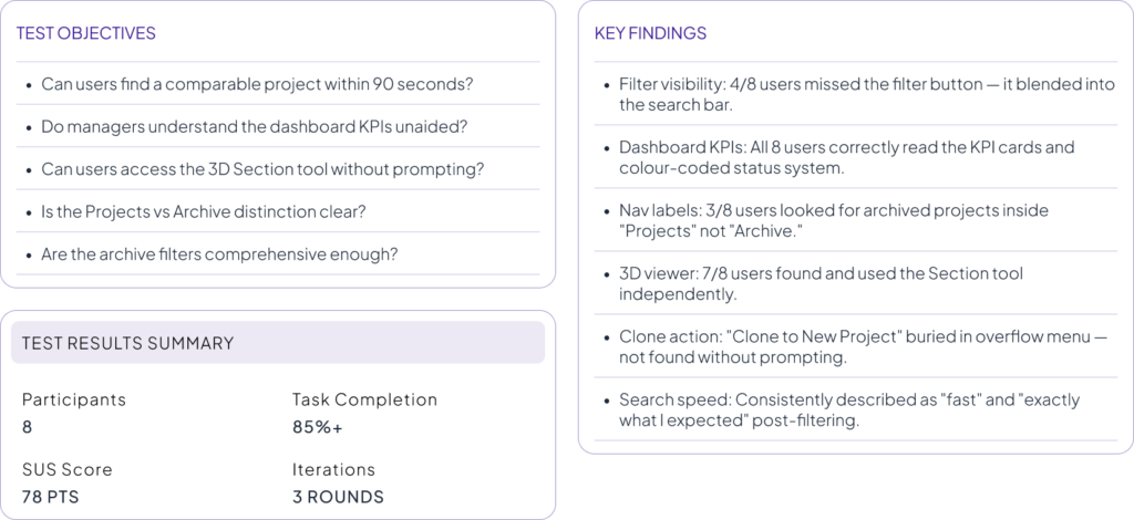
Task completion rate above 85% in testing
↓ “Data hunting” time per project start
05 — Target Audience
Who this is built for
Primary Users
Secondary Users
Structural / Bridge Engineers
Technical professionals who need quick access to past project data, design standards, and calculation templates to speed up design validation.
Digital / BIM Coordinators
Administrators and quality teams responsible for data accuracy, digital delivery compliance, and maintaining the platform’s building block library.
Design / Project Managers
Management teams who need portfolio visibility, project tracking, and task management across multiple projects.
Platform Administrators
Technical superusers who manage platform access, data integrity, and the central knowledge library while keeping the platform aligned with evolving project needs.
06 — User Personas
Three people, one platform
Derived from the research insights provided, these personas represent the primary user archetypes across the platform. Each brings distinct needs, motivations, and frustrations that shaped design decisions throughout the process.
07 — Research Insights
What the research revealed
Key patterns from stakeholder interviews conducted by the client’s domain team — the foundation for all design decisions.
The Knowledge Retrieval Problem
Getting historical data could take “days rather than seconds.” Finding a comparable project meant navigating multiple systems and hoping the right person still worked there.
The “Starting From Scratch” Pattern
Every stakeholder independently described frustration with beginning new projects as if nothing similar had ever been done — despite decades of institutional experience.
Speed is Non-Negotiable
“Blazingly fast” search. No more than 2 clicks to save. Any friction causes engineers to revert to personal drives and email — making the system invisible.
Managers Need Signals, Not Data
PMs didn’t need granular technical data — they needed live project health, resource status, and delivery flags. Exceptions surfaced automatically, not buried in spreadsheets.
Adoption is a UX Problem
Mandating systems without user buy-in produces compliance theatre. Any solution needs to feel natural — not like an admin burden. UX is what drives real adoption.
Everything Must Connect
Multiple stakeholders independently described the same vision: project inputs, analysis, deliverables and management data all linked to one underlying source of truth (SPOT).
08 — Empathy Mapping
Inside the engineer's mind
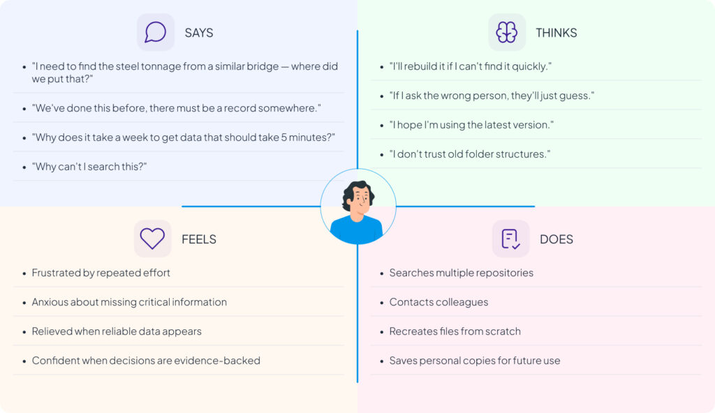
Built from synthesised research insights, this empathy map reflects the mindset of the primary user — a structural engineer dealing with daily data friction.
09 — Current Journey Map
The painful path
This map traces the experience of an engineer starting a new project and attempting to leverage past work. Every stage contains friction, delay, and uncertainty.
10 — How Might We Statements
Reframing problems as opportunities
Reduce search time from days to seconds for comparable project data?
Make starting a new project feel like building on solid foundations?
Give managers a live portfolio view with zero manual data collection?
Enable project parameter comparison without manual spreadsheet work?
Show connections between projects, data, and people without overwhelming the UI?
Create a 3D viewer that adds genuine value beyond being visually impressive?
Make saving data so frictionless that engineers actually want to do it?
Ensure institutional knowledge doesn’t leave when team members do?
Design navigation that works for both engineers & managers — despite different mental models?
11 — Brainstorming & Ideation
Generating and prioritizing ideas
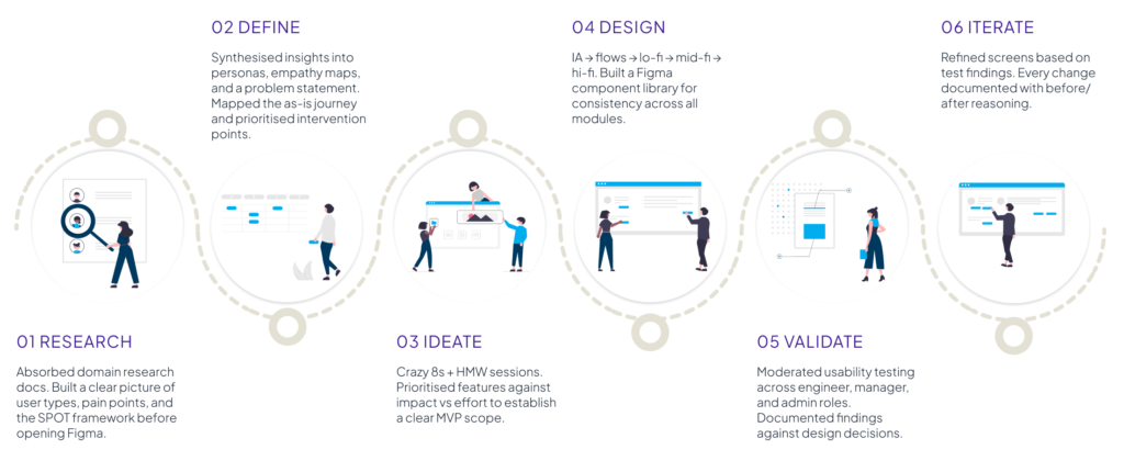
After mapping the research into HMW statements, I ran an ideation phase to explore the full solution space before committing to a design direction. The goal was to diverge first — even wild ideas — then converge on what was viable, desirable, and technically feasible.
Crazy 8s Concepts
Eight concepts explored in rapid sketching included: a command-line style search interface, a project graph/network visualisation, a Kanban-style portfolio board, a file-system-like hierarchical browser, a chat-first interface with a project assistant, a map-based archive for geographic search, a comparison table tool, and a dashboard-first single-page approach. The map-based archive, the dashboard overview, and the comparison approach all survived to IA exploration.
Prioritisation Matrix
Feature
Impact
Effort
Projects Dashboard
High
Medium
Archive + Search
High
High
3D Model Viewer
Medium
High
Building Blocks
High
High
Project Comparison
High
Medium
12 — Information Architecture
Structuring the knowledge space
The IA was built around four primary navigation destinations, each serving a distinct job-to-be-done. The hierarchy is shallow by design — users should reach any critical view in two clicks or fewer.
13 — User Flow
Finding precedent data — the critical path
This core user flow traces the journey of an engineer searching for a comparable past project. It was the most frequently cited task in the research and became the primary design test case.
Decision point: If a project is found → view details → choose to clone or extract building blocks. If no results → refine filters or save search. The flow supports both “browsing to discover” and “searching for a specific known project.”
14 — To-Be Journey Map
The experience we designed towards
15 — Low-Fidelity Wireframes
Early concepts and layout thinking
The wireframe phase explored structure, hierarchy, and content priority before any visual decisions. Key questions at this stage: What does the user see first? What can they do in one click? How does the layout scale across the four primary modules?
16 — Visual Design Direction
Precision, clarity, professionalism
The visual language needed to communicate trustworthiness and technical precision — a platform that handles consequential data for engineers making serious structural decisions. The design direction drew on the aesthetic codes of modern engineering software: clean, structured, information-dense without being cluttered.
Clarity First
Every element earns its place. Data is the hero — UI chrome stays minimal. Status, actions, and navigation are immediately obvious without explanation.
Responsive Speed
Visual feedback is immediate. Loading states, hover effects, and transitions signal that the system is responsive — never leaving users wondering if something worked.
Structured Hierarchy
A strict typographic and spatial hierarchy ensures users can scan, not read. Headlines, data labels, body copy, and metadata all have clearly differentiated visual weights.
17 — Style Guide
The design language system
18 — High Fidelity Designs
From concept to screen
The high-fidelity designs brought the IA and visual system together into functional, production-ready screens. Each screen was designed with specific user scenarios in mind.
01
Projects dashboard - unified table view
Risk badges, client, start date, and lead market visible at a glance. Column picker adds financial fields previously only visible in the PI Tool.
Solves: Excel cross-referencing
The Projects Dashboard unified CRM and project information into a single table view, helping teams scan, compare, and manage projects without switching between tools.
Column customization allowed users to control the information visible based on their task. Teams could surface the most relevant data without losing the speed and flexibility of a data-dense workflow.
02
Column customization + typeahead search
Users can surface or hide fields based on their task context. Search works across project names instantly.
Solves: Manual Excel filtering
03
Filter panel — date, revenue, market
Structured filters for the DEB team’s review cycle. Clear All and Apply are separated — important when managing multiple filter states across review cycles.
Solves: Manual project qualification
The filter panel mapped directly to DEB review criteria, helping teams quickly narrow down projects using structured parameters such as risk, market, and dates.
The unified project view brought CRM and PI Tool information into one place, removing the need for manual cross-checking and keeping actions connected to the project context.
04
Project detail — CRM + PI Tool toggle
The most significant consolidation. Both data sources surface in a single view with a toggle. “Request for Review” CTA is contextual — taken in the presence of the data, not in a separate flow.
The interface looks simple. The domain isn’t. Every decision required understanding how engineers think about data — then making that invisible to the UI.
Every design decision needed to trace back to a documented finding. A useful constraint regardless of who owns the research.
IA decisions have outsized consequences
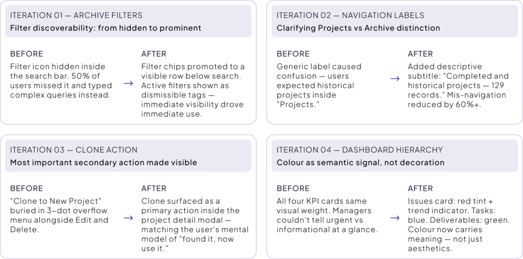
One labelling decision — “Archive” vs “Projects” — caused friction throughout testing. Getting IA right early is worth more than getting visual design right first.
Users told us they understood the navigation — then navigated incorrectly in tasks. Testing with scenarios, not questions, reveals what actually needs solving.
Speed is a design value
Users explicitly said: if it’s slow, they won’t use it. Designing for perceived performance — hover states, immediate feedback — was as important as functional design.
What’s next: Side-by-side project comparison view, mobile-responsive layout for on-site access, and a formal building-block contribution workflow.
24 — Reflection
What I brought to this project
Project Flow combined complex engineering workflows with intuitive usability. For engineers, every interaction needed to be fast, clear, and efficient.
The biggest challenge was understanding engineer mental models and making complex data feel simple. Features like the 3D Viewer, Map Archive, and Project Details required careful prioritization.
Working from existing research reinforced a key principle: every decision should be backed by real user insights.
The design improved through user testing and observed behaviour, proving the value of evidence-based design over opinion.