Automate Design Review

Replacing a 5-tool manual workflow with a unified platform that connects project data, stakeholder communication, and review tracking — purpose-built for a global engineering firm's Design Excellence Board.

Role
Product Designer
Timeline
08 Weeks
Platform
Web App (Internal)
DELIVERABLES
IA · Journey Maps · UI/UX Design
CONTEXT

A quality process that was silently failing

The team was responsible for ensuring every medium and high-risk engineering project underwent a formal peer review before reaching the tender stage. The review procedure was well-designed on paper — a 3-person review panel, structured feedback forms, defined timing windows. But in practice, the process was being held together by spreadsheets and email threads.

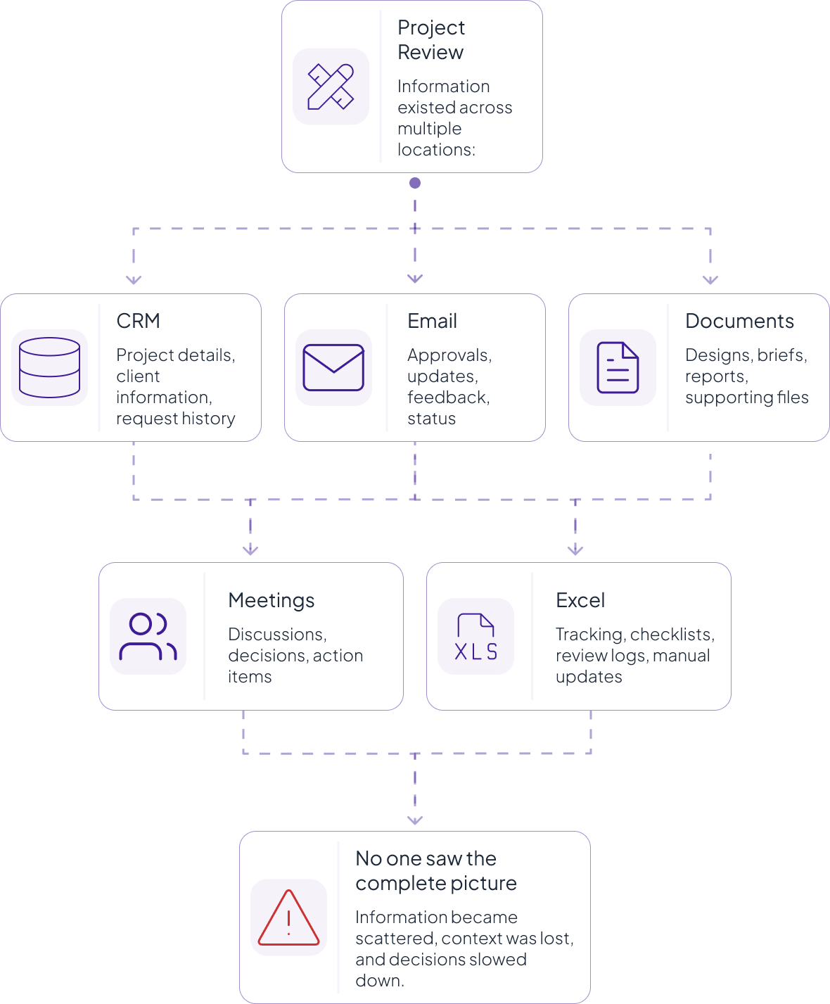
No one person could see the full state of reviews across active projects. Projects could miss their review window entirely. The team running the process had no way to confirm whether a project owner had even opened the notification email.

Key Users involved:

  1. Heads of Design
  2. Project Owners
  3. Review Teams
  4. Project Managers

The Problem

Every review started with an Excel file

“The DEB team was functioning as human middleware between systems that should have talked to each other.”

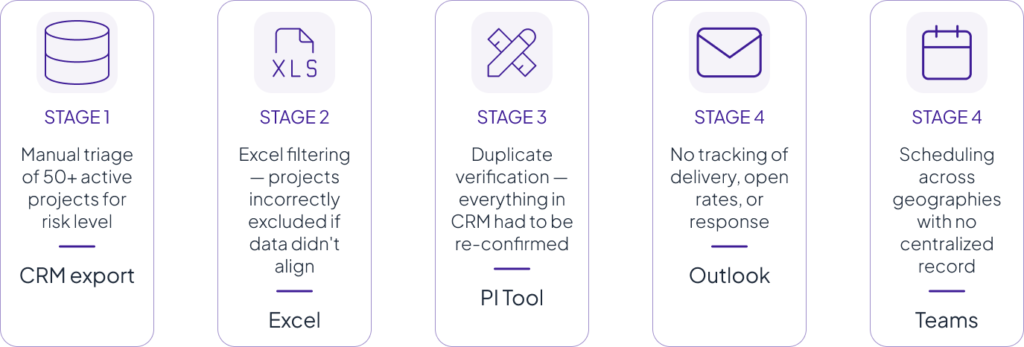
The current process spanned 5 touchpoints across 3 separate tools — CRM, Excel, PI Tool, Outlook, and Teams. At every handoff, data was manually transferred, verified, and re-entered. The same project information existed in multiple places, owned by none of them.


Research & Discovery

5 stages, 5 tools, all manual

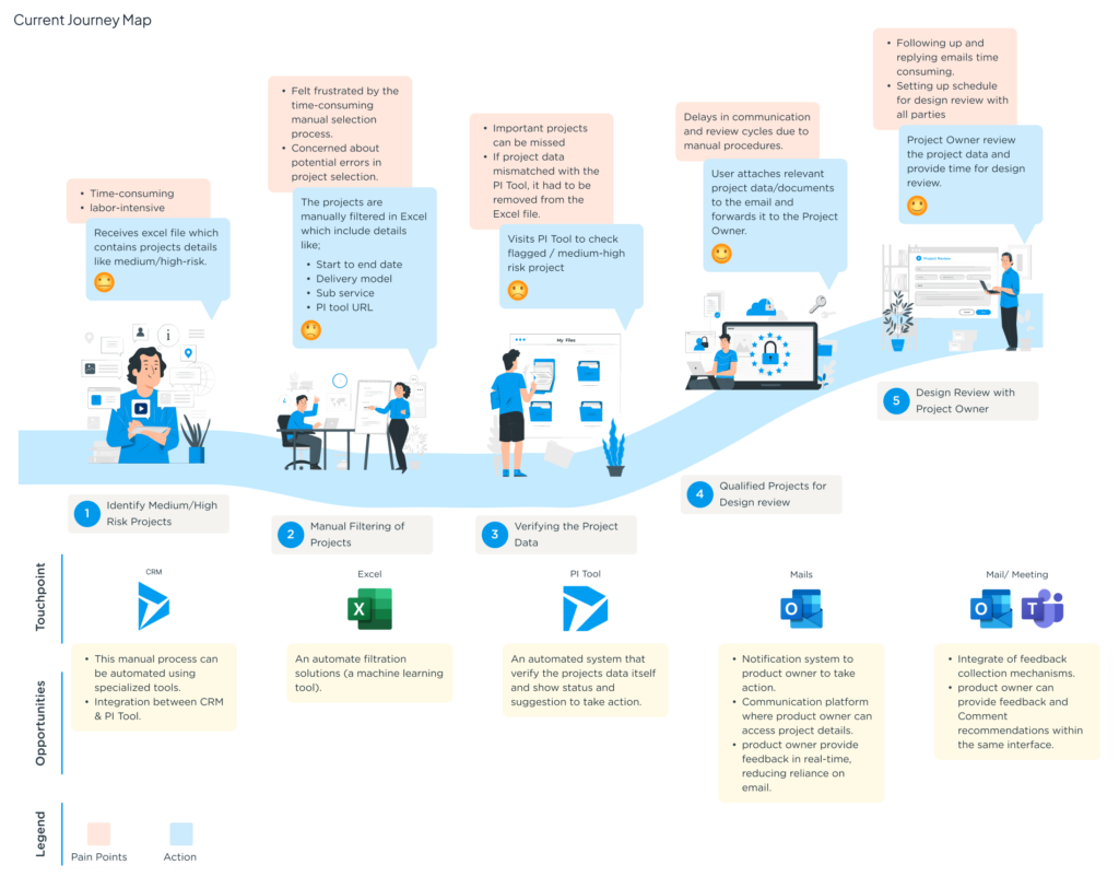
Mapping the existing journey exposed where the real friction lived — not in any single step, but in the transitions between tools where information had to be re-entered, re-verified, or re-communicated.


KEY INSIGHT

Early in the research, manual filtering appeared to be the biggest pain point. But mapping the workflow revealed a deeper issue — the Excel cross-referencing step existed because teams didn’t fully trust the CRM data. Users repeatedly verified information in the PI Tool due to mismatches in risk levels, dates, and team assignments.

This shifted the design direction. Instead of improving individual tools or adding another layer on top of Excel, the opportunity was to create a single platform that brought everything together and removed the need for manual cross-referencing.

“Unify the data, and the verification step disappears entirely. The problem wasn’t how people worked — it was how the systems were structured.”


Information Architecture

Three workflows, one platform

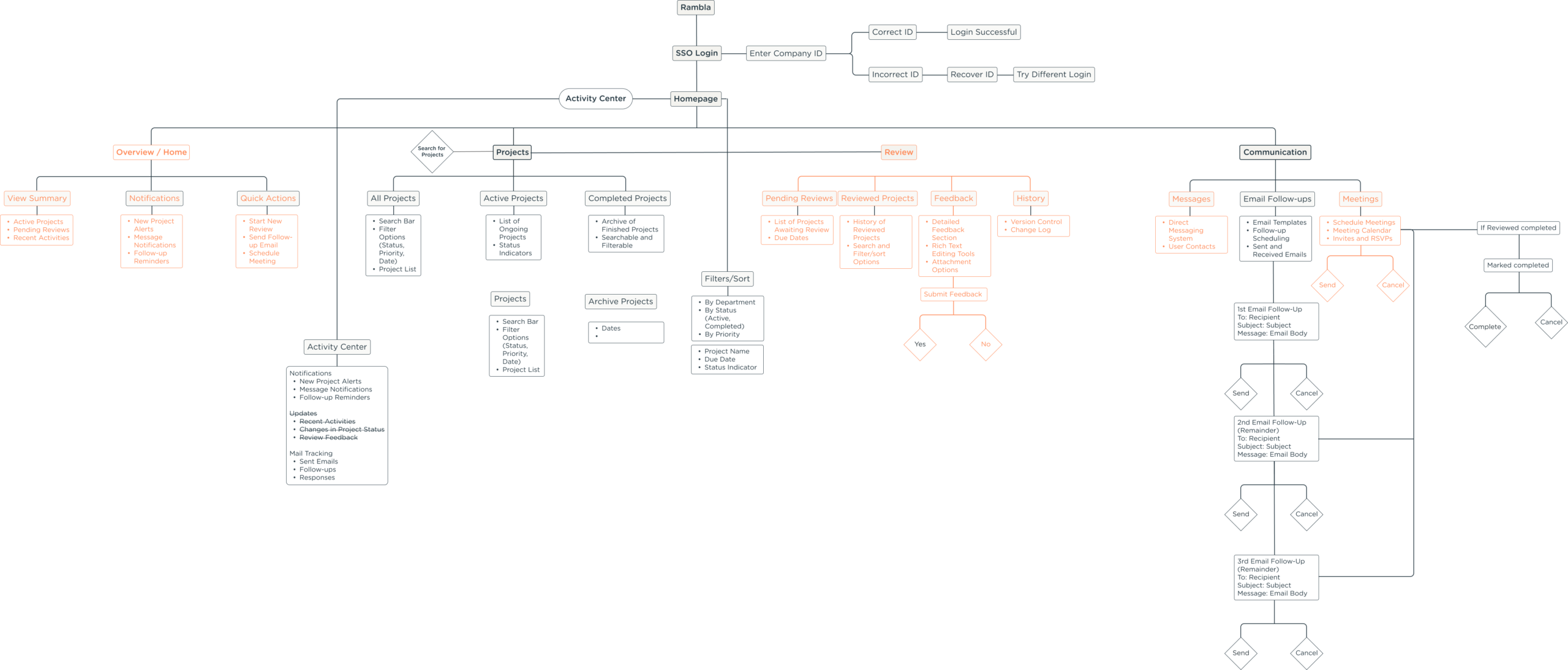
Before moving into screens, I structured the platform around three core workflows used by the DEB team, with each workflow mapped to a dedicated module. I also introduced an Activity Center as a shared layer to centralize notifications, updates, and mail tracking across the experience.

Projects
Table-first layout with customisable columns. Engineers work in data-dense environments — a card layout would have required more clicks to reach the same information. Column visibility toggles let users expose financial data (contract revenue, project numbers) that previously required a PI Tool visit.
Review 
Deliberately separated from the project list. The person initiating a review and the person completing one are often different stakeholders with different needs and permissions.
Communication
Not just messaging — the entire DEB notification workflow. Auto-populates recipient fields from project role assignments. Templates pre-fill subject and body copy. A 3-stage timeline tracks Send → Review → Complete without leaving the platform.

Solution

01

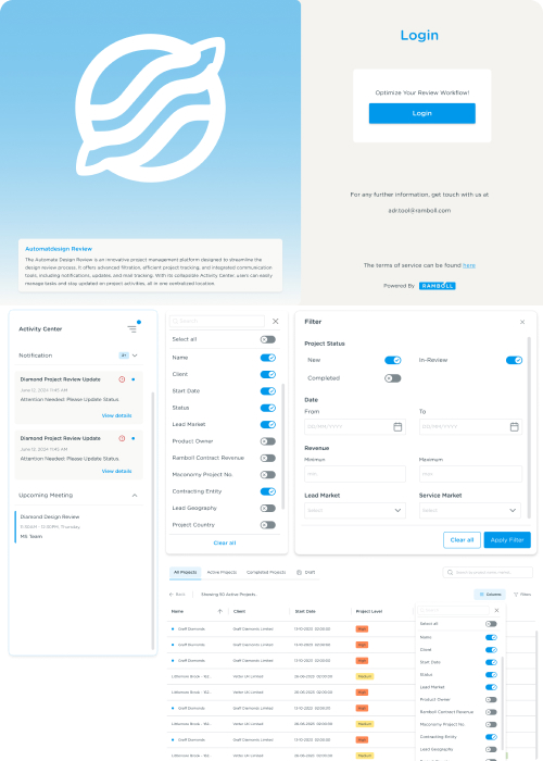
Projects dashboard - unified table view
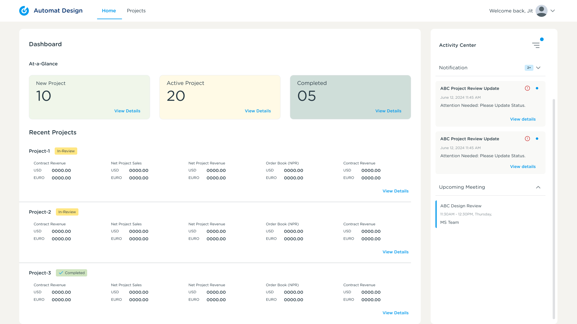
Risk badges, client, start date, and lead market visible at a glance. Column picker adds financial fields previously only visible in the PI Tool.
Solves: Excel cross-referencing

The Projects Dashboard unified CRM and project information into a single table view, helping teams scan, compare, and manage projects without switching between tools.


Column customization allowed users to control the information visible based on their task. Teams could surface the most relevant data without losing the speed and flexibility of a data-dense workflow.

02

Column customization + typeahead search

Users can surface or hide fields based on their task context. Search works across project names instantly.
Solves: Manual Excel filtering

03

Filter panel — date, revenue, market
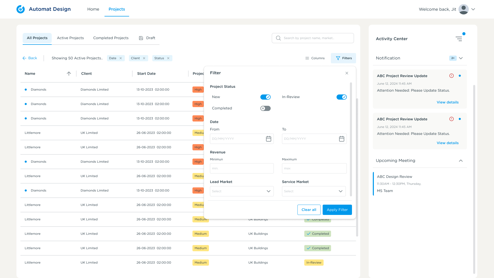
Structured filters for the DEB team’s review cycle. Clear All and Apply are separated — important when managing multiple filter states across review cycles.
Solves: Manual project qualification

The filter panel mapped directly to DEB review criteria, helping teams quickly narrow down projects using structured parameters such as risk, market, and dates.


The unified project view brought CRM and PI Tool information into one place, removing the need for manual cross-checking and keeping actions connected to the project context.

04

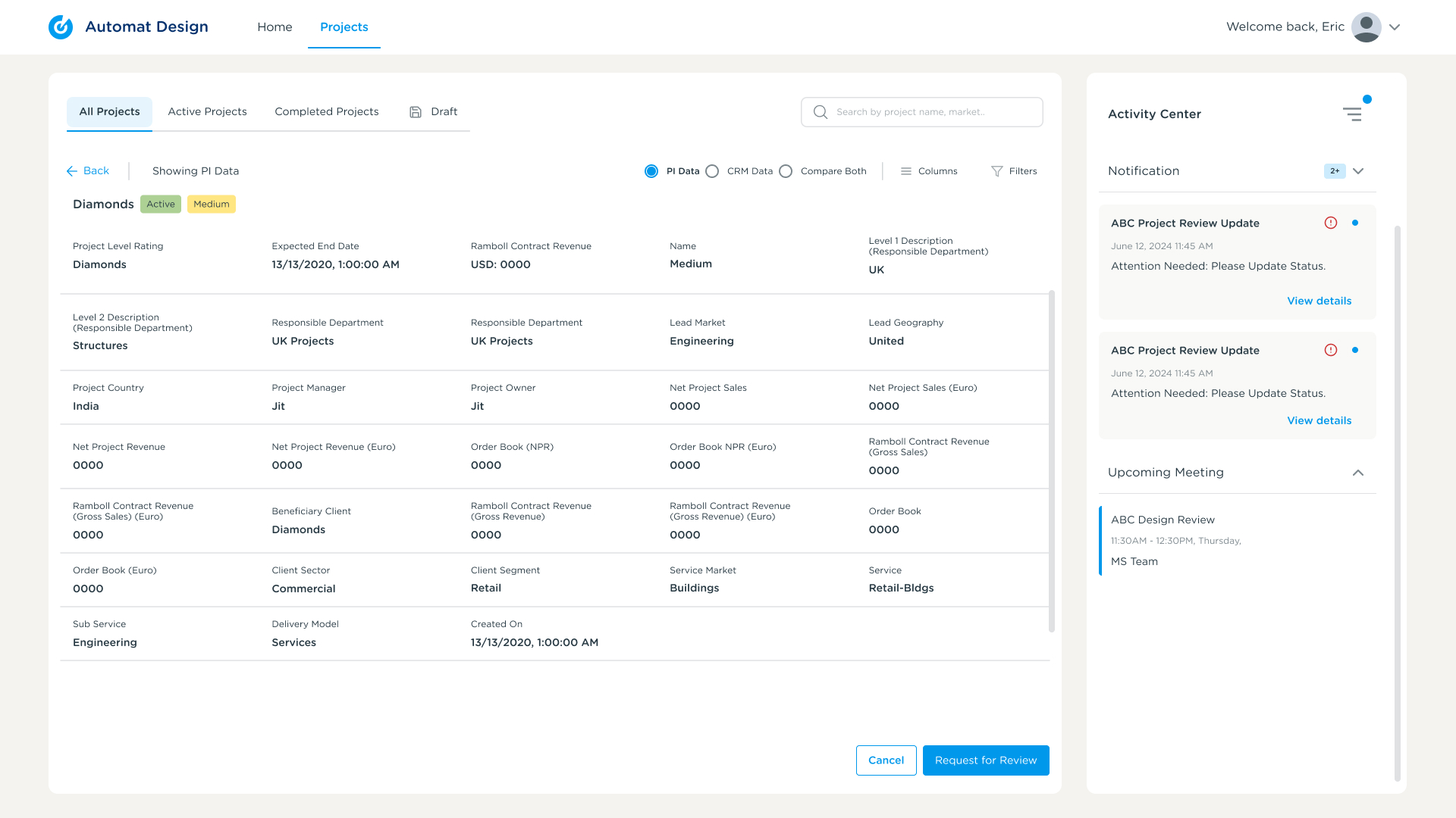
Project detail — CRM + PI Tool toggle

The most significant consolidation. Both data sources surface in a single view with a toggle. “Request for Review” CTA is contextual — taken in the presence of the data, not in a separate flow.
Solves: PI Tool verification step

05

Communication composer — auto-populated recipients
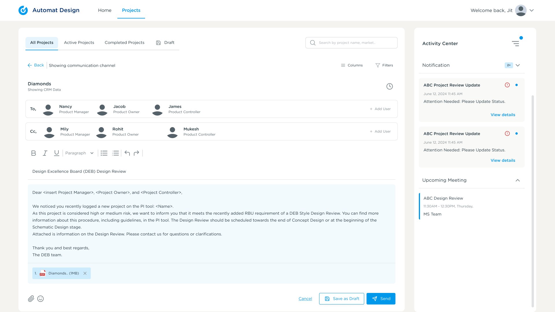
To and CC fields pull from project role assignments. DEB template pre-fills subject and body. Relevant project docs auto-attach.
Solves: Manual email drafting

The communication composer reduced repetitive work by automatically filling recipients and templates from project data, turning email coordination into a more structured workflow.


Previously, teams relied on email chains and manual follow-ups to track progress. The 3-stage timeline centralized updates and made review status immediately visible.

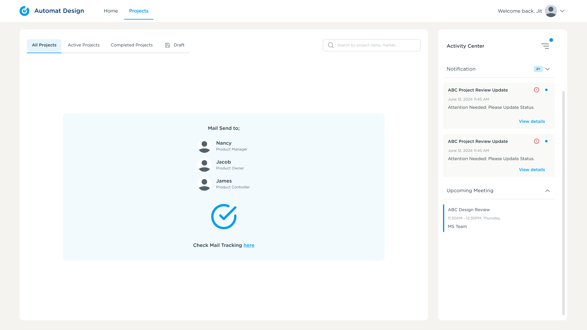
06

Mail tracking timeline — 3-stage progress

After sending, the Activity Center updates with a live timeline: Sent → Reviewer Reviews → Review Done. The DEB team can see exactly where each project sits at any moment.
Solves: Email follow-up anxiety

The Activity Center was designed as a persistent right panel — always visible, never a separate page — because the core user anxiety in the old process was not knowing what was happening.


Design Decisions

Every major design decision in this platform was a direct response to a specific pain point in the current journey map. None were aesthetic preferences — each was a tradeoff consciously chosen over alternatives.

Why table-first layout over cards?

DEB team members worked with 40–60 active projects at a time. A table-first layout made comparison faster and better matched how engineers already worked with data-dense project lists and Excel workflows.

Why a persistent Activity Center panel?

The biggest frustration in the previous workflow was not knowing what was happening. Keeping notifications, updates, and mail tracking always visible — rather than hiding them on a separate page — gave the team continuous awareness of review progress without extra navigation.

Why separate Projects and Review modules?

The people initiating reviews and completing reviews often had different contexts, responsibilities, and permissions. Keeping both workflows in a single view would create unnecessary noise and reduce clarity for each user type.

Why embed Communication inside the platform?

Review coordination previously relied on repeated email threads with no shared record. Bringing communication inside the platform created an audit trail, enabled mail tracking, and kept all review context in one place. The 3-stage timeline only works because sending happens within the system.

Outcome

What the platform replaced?

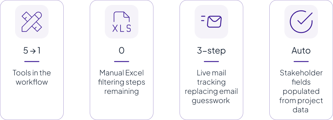
The platform replaced five manual steps across three external tools with a single workflow.


Reflection

What I learned?

This project helped me understand how enterprise UX goes beyond interface design into systems thinking and workflow orchestration. The challenge wasn’t simply creating a better UI, but understanding why manual effort existed in the first place and designing a system that made it unnecessary by design.

01

The real problem is rarely what’s reported first.

Stakeholders initially asked for better filtering, but the journey map revealed a deeper issue — fragmented data ownership across multiple systems. Solving the right problem meant looking beyond the visible pain point and identifying the root cause.

02

Visibility and coordination matter more than features.

The most impactful design decisions — the Activity Center, mail tracking timeline, and data toggle — didn’t add new capabilities. They made existing information visible in the right context at the right time.

03

Resisting feature creep is a design skill.

The DEB process followed a defined structure with specific roles, timelines, and workflow requirements. Every design decision needed to respect that foundation while reducing manual effort around it. Understanding what not to redesign became just as important as knowing what to change.

04

Information architecture is the hardest deliverable to get right.

Separating Projects, Reviews, and Communication wasn’t obvious from research alone — it emerged from understanding that the same information can serve different needs, depending on who is viewing it and when they need it.